Mobile Options Overview
Main Street Sites mobile options allow you to define alternate behavior for your web pages when they are accessed by mobile devices. This can provide a much more satisfying experience for customers who access your website with smartphones.
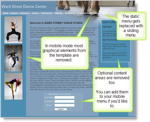
The mobile options feature automatically removes all extraneous graphical elements from your website template. It replaces the static menu with a sliding menu. It also removes sections of the home page, such as the news items and contact list sign-up form. Those sections can now be linked to explicitly from your menu if you wish to do so.
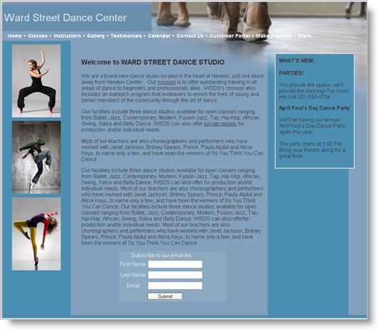
For example, here is a sample Main Street Sites website in normal mode:
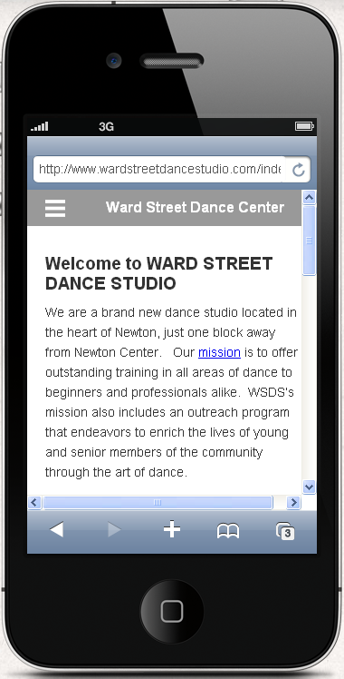
A mobile version of the home page might look like the image below. The header images and sidebar content areas have been removed, and the menu is accessible using the button on title bar:
This image highlights some of the differences between the two versions of the home page:
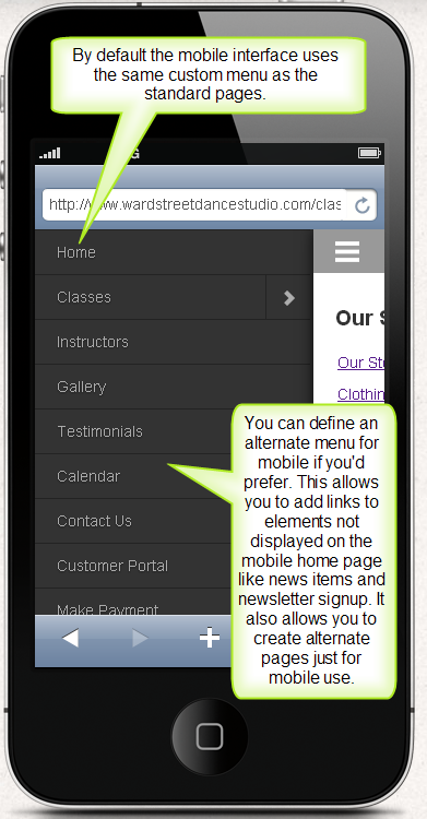
Here is an example of the sliding mobile menu. By default, the main custom menu for your account will be used. You can choose to define an alternate menu for mobile users if you wish to. This can be useful for adding links to removed elements like news items and the contact list sign-up form.
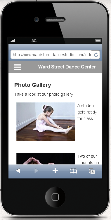
You may find that many of your existing pages will work quite well in mobile mode. Here is an example of the built-in gallery page:
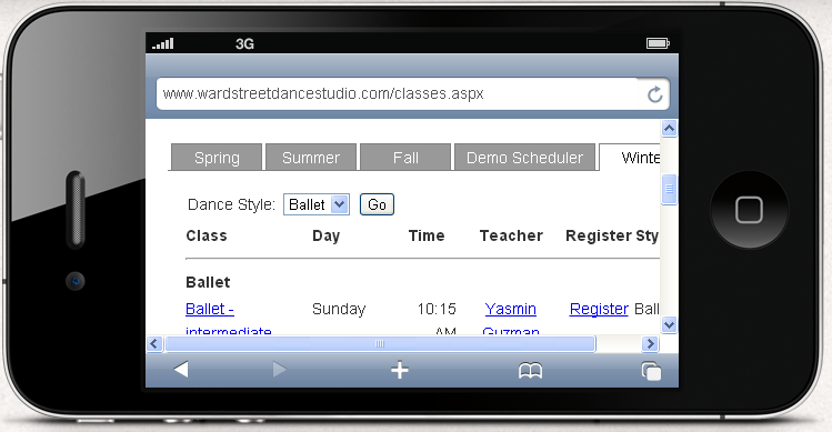
Other pages will need some attention to fit nicely in the smaller screen area. Below is an example of a wide classes page. In this case, you might decide to go to Website > Settings > Named Layouts and remove a few columns from the classes page layout. See Using named layouts for more information on updating the layout of your classes page.
Note: It is possible to create an alternate classes page that is optimized for mobile use. In that case, you would do the following:
- Go to Website > Vault > Page Vault to create the new page.
- Go to Website > Settings > Mobile Options, and select the "Mobile Menu" tab to reference the page in the mobile menu.
- Go to Website > Settings > Named Layouts to create a narrow layout for your mobile classes page.
- Go to Website > Vaults > Component Vault to create a new classes component that will use your new layout.
- Insert the new component onto your new page in the Page vault.
As always, please ask Main Street Sites customer support for help if needed.
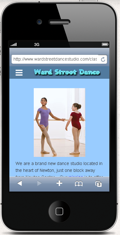
Because the mobile options feature includes all of the features of Main Street Sites, you can create a highly personalized version of your mobile pages if you wish to. Here is an example of the same site with a custom logo, background color, and an additional image.
IMPORTANT NOTE: Mobile features are not activated automatically for your Main Street Sites account. Please visit Website > Settings > Mobile Options if you wish to activate this feature. This feature is available for Premium website customers and standalone Back Office customers only.