Component Vault
Components are a powerful tool that you can use to put a class schedule anywhere on your website.
A component can show a list of classes using the format specified by any named layout that you have created. To use components, you'll need to create a new named layout (or use the default class layout that was created for you). See How to customize your class schedule for more information on creating named layouts.
To add a new component, go to Website > Vaults > Component Vault. Each component you create will be listed in your Component Vault grid. The
grid will be empty the first time you use this page. The example below
shows the grid with just one component created.
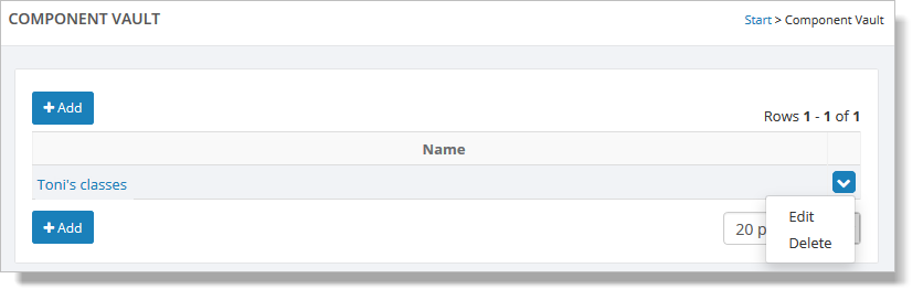
If you need to change or remove any of the components, from the Component Vault grid, hover over a component and click the blue down arrow on the far right. This action displays a drop-down list with both the "Edit" and "Delete" commands. You can also edit a component by clicking its name. This action displays a popup with the component information (see below).
Click on the "Add" button, and you will be presented with a blank form. This is where you define information about the component.
You will need to select a Named Layout and provide any filters you would like this component to use. For example, if this component will be showing classes for a single teacher, select that teacher in the filters section (as shown here):
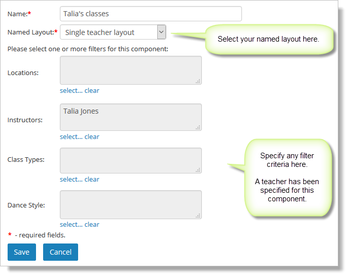
The filter popup will show a list of teachers, locations, etc. Select the values you wish to use for this component.

Once you have saved your component, it can be inserted into any page on your site, as shown here:
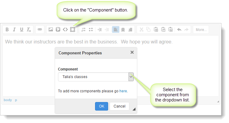
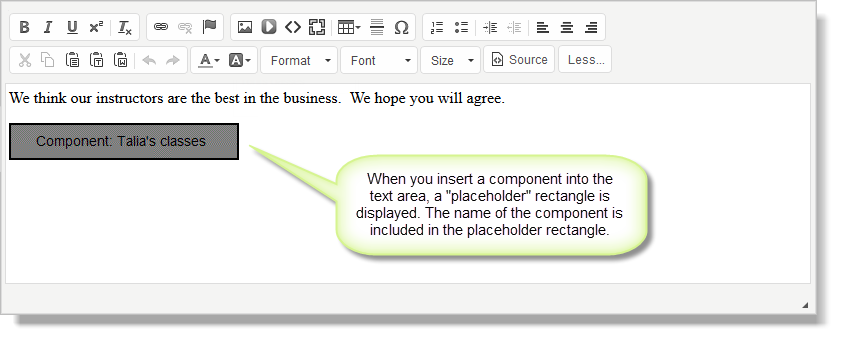
Components are represented by a placeholder rectangle in the text area, as shown below:
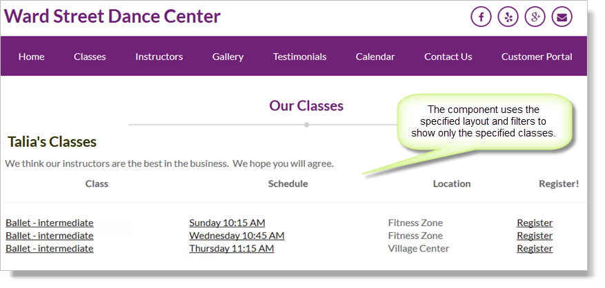
The component will show all classes based on the filters and named layout you specified. Here is a component showing classes for a single teacher.
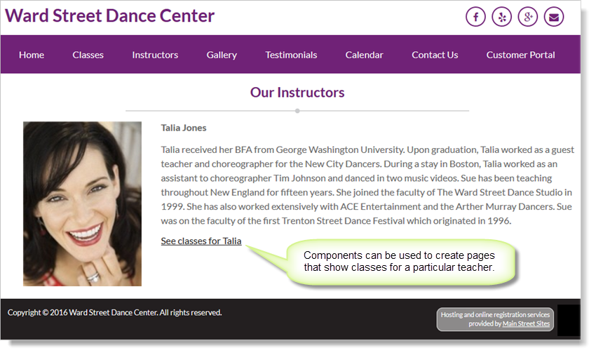
To continue the example, you might want to link to this page from the teacher's bio on the Teachers page, as shown here: